Product Design · AI Emotional Companion App
Bestie AI
Role
Product design, working alongside engineering, growth and PM. I own the visual side and shaped the relationship feature end to end; the subscription flow was designed with PM.
Duration
Dec 2025 - Jul 2026
Type
Mobile Product / AI-Native Features
Skills
Product Design, UI/UX, Monetization UX, Design Systems
Tools
Figma, Rive, AIGC tools
An AI companion's memory is only as meaningful as the surface that carries it. Bestie remembers the people you talk about; I designed the feature that turns that memory into something you can feel.
Bestie is an AI emotional-support companion with five personas, used mainly across Europe, the US and Japan. Embedded in the AI-native team, I also worked on the subscription flow, but this page leads with the work I owned end to end.
Context
A product whose job is to care
Bestie is built on one refusal: not another single chatbot. Instead, a private squad of five AI personas weighs in on the same problem, each with a distinct voice, Cory the strategist, Vix the blunt realist, Pavo the social tactician, Buddy the warm companion, and Luna the intuitive guide. Users vent about relationships and stress, upload chat screenshots for a multi-angle read, and watch conversations turn into daily insights, a relationship map, and a growing “mind garden.”
The team is around 30 people. Design started as two and is now just me, and I joined while the product was in its growth stage.
The design question
The model knows your people. What should the product do with that?
Bestie's model already extracts the people from your conversations, one profile per person, built automatically, no forms. That capability has two failure modes: shown raw, it reads like a CRM; shown carelessly, it reads like surveillance. The design problem was to make machine memory feel like being known, not being tracked. Every decision below answers to that.
Zero to one
From a contact list to a felt universe
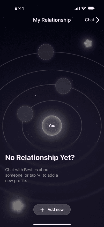
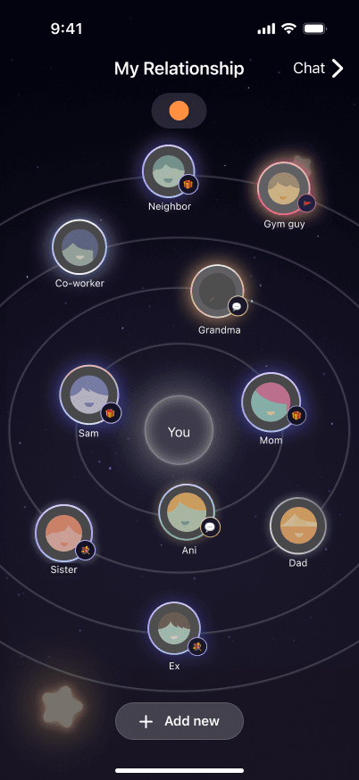
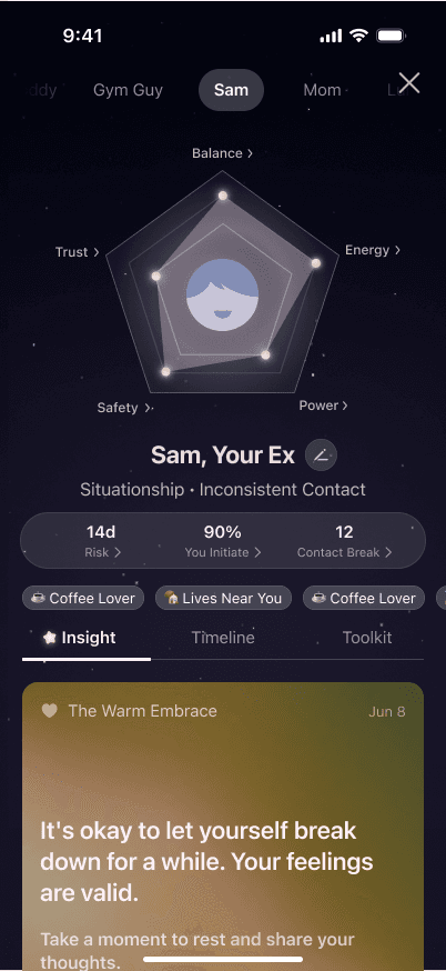
When I picked this up, the feature existed as a flat list of contacts, functional, and exactly the CRM failure mode. I designed what it became: you sit at the center, the people in your life orbit you, and each person opens into a profile the model keeps for you.
I came in early, with the goal defined but the shape of the feature still open. We shaped the information architecture together with PM and engineering — what a person is in this product, what the model keeps about them, and how it all fits. The moves that gave it its form were mine.
Before
After
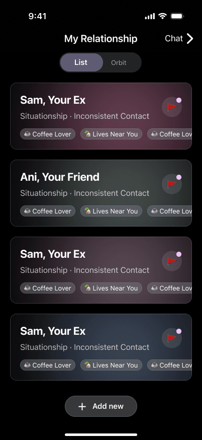
Alternatives
Orbit wasn't the first shape we tried
Before the orbit, we prototyped a timeline, a card wall and a map alongside it, then put it to a team vote. The orbit won because it was the one where relationships read as relationships at a glance, distance standing in for closeness, instead of a list to scan or a timeline to scroll.
The moves
Three decisions that made it feel like Bestie
After launch a committed core of users built their maps out in depth. The category mix told us the feature outgrew its trigger: Family emerged as the largest group, ahead of Romantic, with Friend, Professional and Acquaintance close behind, and users drift from romance-first questions at trial toward family and even workplace circles as they settle in. What people actually built with it is a private map of everyone who matters, not a dating decoder.
Under the hood
What decides where you sit, and what happens when your world gets crowded
The line
Warmth, not manipulation
A feature that shows people their own relationship patterns, inside a product that also sells subscriptions, walks a well-documented line: dependence loops and manipulative upsells are the dark side of companion apps. Part of the job was knowing where that line is.
The first version pointed the analysis outward: it read your friends and partners and told you what they were like. It tested well as a hook, but it sat wrong with me, so I talked it through with a friend who works in psychology. The conclusion was that handing someone a verdict on the people they love is the manipulative version of this feature, it invites judgment, not understanding. I reframed the whole thing to analyze only the user: the radar reads yourpatterns inside a relationship, never the other person's character. Same data, opposite posture, and it's the decision I'd defend first.
Monetization system
A paywall that follows the user, not one screen
Alongside the relationship feature, I partnered with PM on subscription — the product's most consequential flow. The work wasn't a single paywall; it was a system that reshapes itself around who the user is and the moment they hit a wall, built on one rule: a tier is a depth of companionship, not a bandwidth plan. In a companion app the upsell is the moment a friend asks for money, so upgrading has to read as getting closer, not buying more quota.
Same ask, shaped to the moment
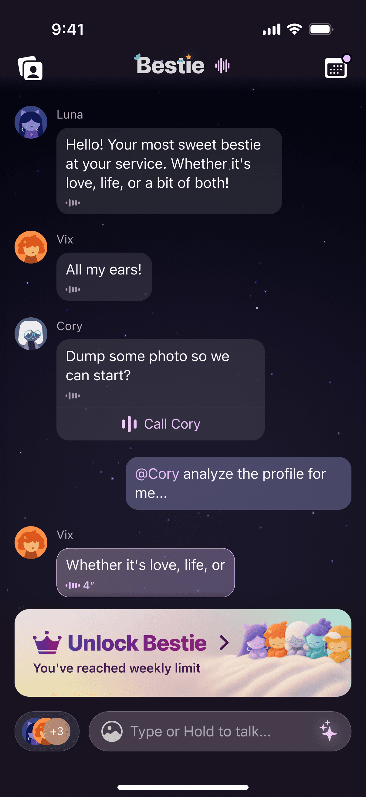
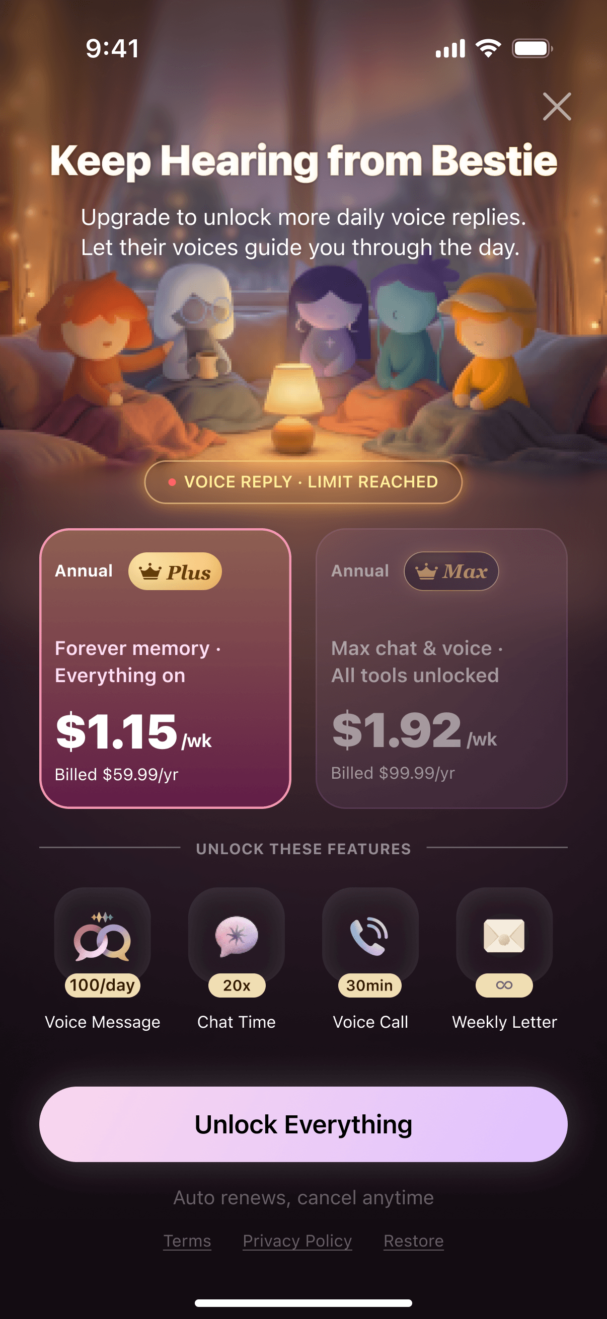
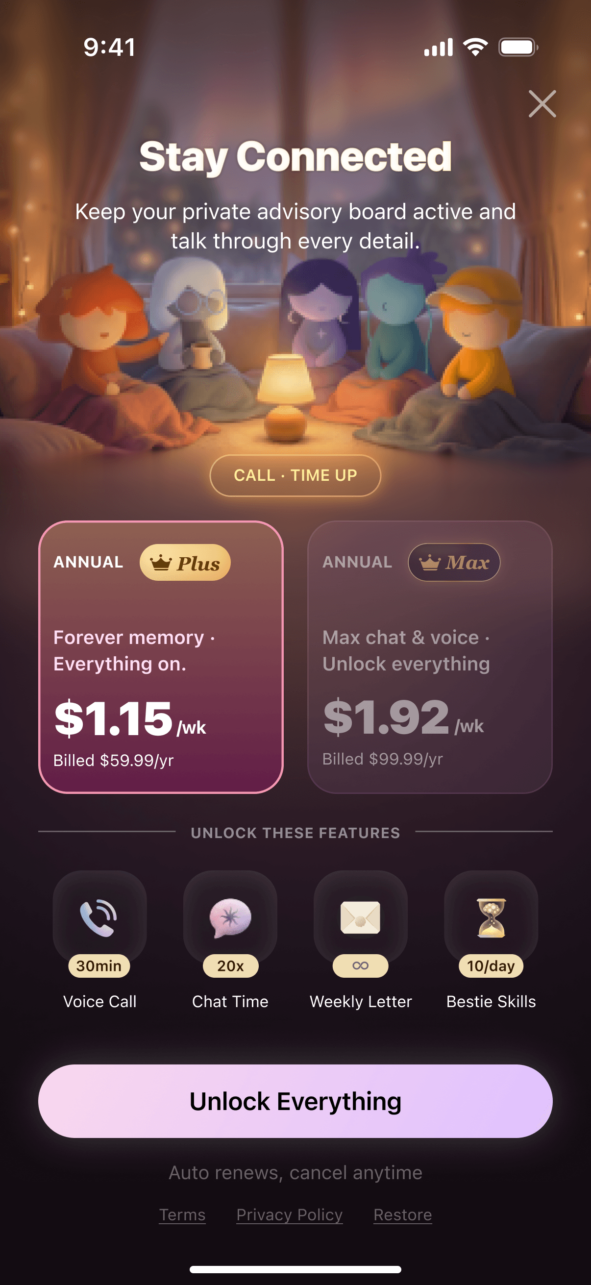
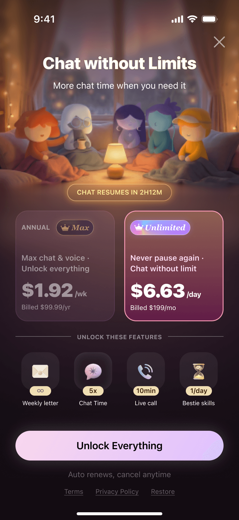
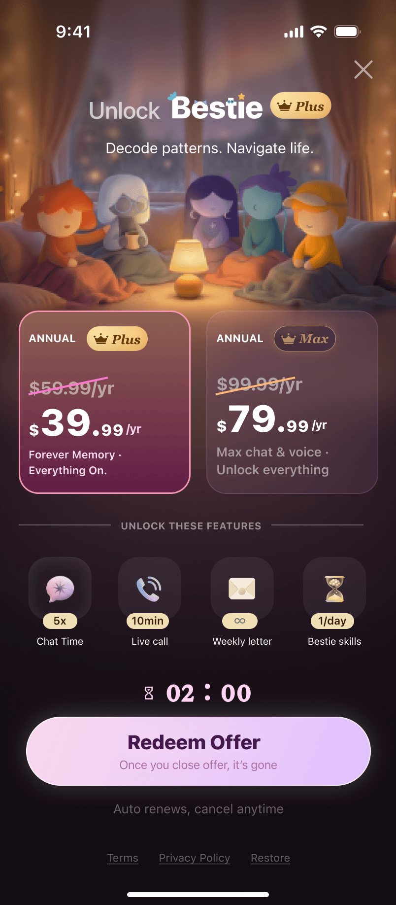
The paywall reskins to whichever limit the user just reached: a soft banner in chat when the weekly quota runs out, and a full screen whose headline, trigger and unlocked features change with the feature — voice replies, live calls, or Bestie tasks.
One ladder, and a way back
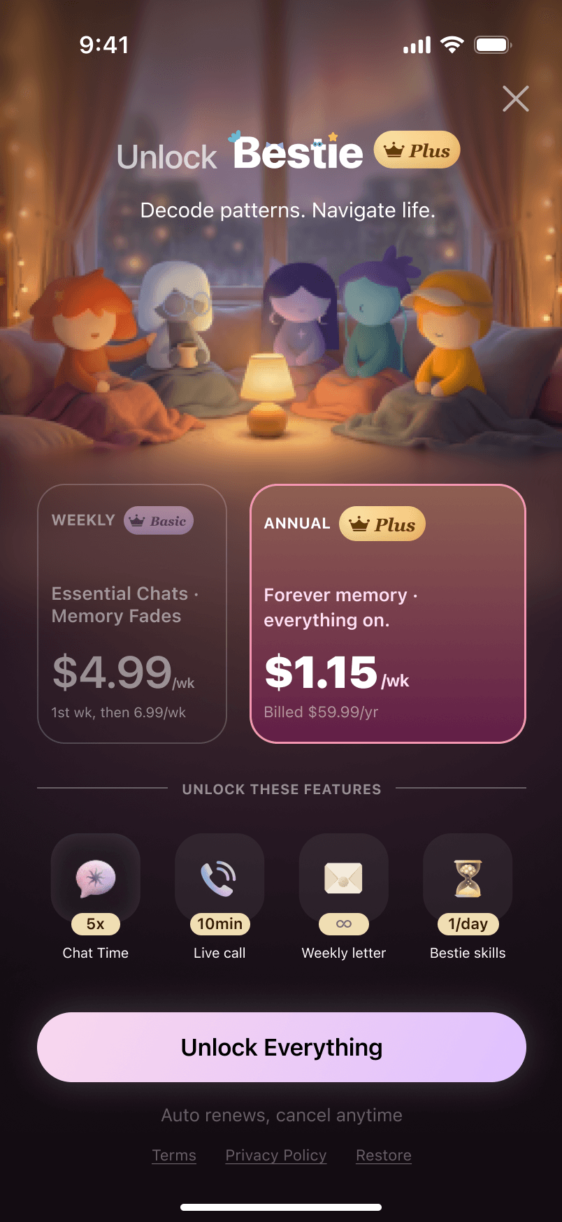
Each rung — Basic, Plus, Max, Unlimited — is framed by what it actually gates. On the weekly plan Bestie's memory fades and the relationship map holds a few people; higher up, memory is kept for good and the map goes unlimited. The top tier doesn't sell a bigger quota, it sells the promise that Bestie never forgets you. The annual plan is quoted by the week so it can be read against the weekly one, rather than as a lump sum. For lapsed users the same rule holds in a lighter register: a banner counting down to when free access returns, and a time-boxed offer that arrives as a gift rather than a nag. I designed the paywall, banners and win-back surfaces with PM.
Outcomes
What shipped, what moved
What I take from this
When a model already knows something about you, the design question stops being what can we display and becomes what posture should the product take. An orbit instead of a list. A radar pointed at you instead of at the people you love. An upgrade that reads as getting closer instead of buying more quota. Those are the same decision made three times, and none of them are visual choices. Working on an AI-native product is mostly this: deciding how a system that knows you should behave toward you. That is the work I want to keep doing.
The most AI-native half of this role, writing the rules a generation pipeline must follow and designing its human-in-the-loop checkpoints, is a separate story: AI Creative Pipeline for Growth →